Rich text content items
rich-text-content-items #EIFE version 0.1 | 5m Read time
Structured text section
View edit form
The ‘Structured Text Section’ is a rich text content item that enables editors to craft detailed paragraphs complete with a section title, an H2 paragraph title, and descriptive text. If additional sub-headers are required within the text, it is advisable to incorporate them using the heading options available in the WYSIWYG editor. For creating distinct sections, it is recommended to start each new content item with an H2 title, ensuring clear hierarchy and readability in your content structure.
View display mode
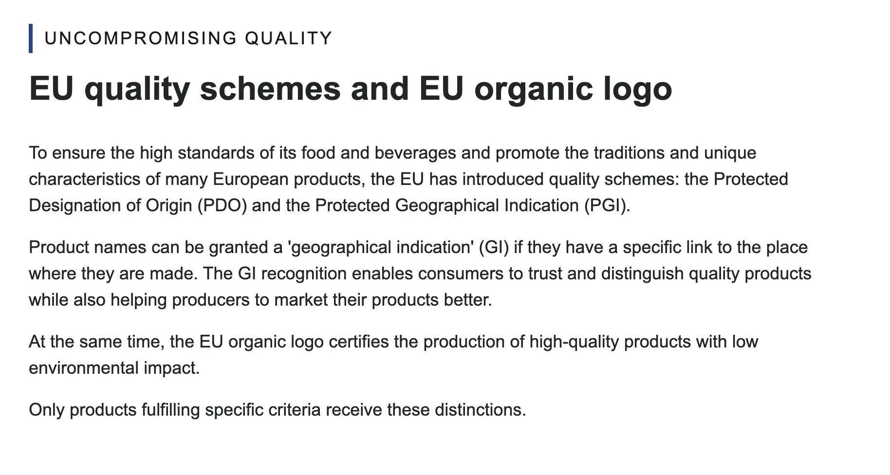
Note - on structured text hierarchy
For accessibility compliance, maintaining a clear text hierarchy is essential. In the content items section, the hierarchy must always be respected. The order should follow: H1 for the page title, H2 for the section title, followed by H3, H4, and so forth. This structured order ensures content is logically organised and accessible.
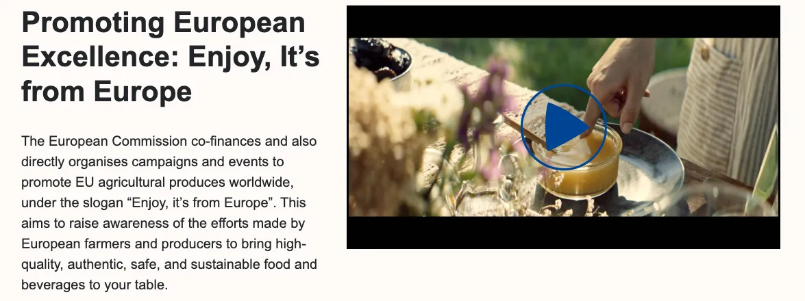
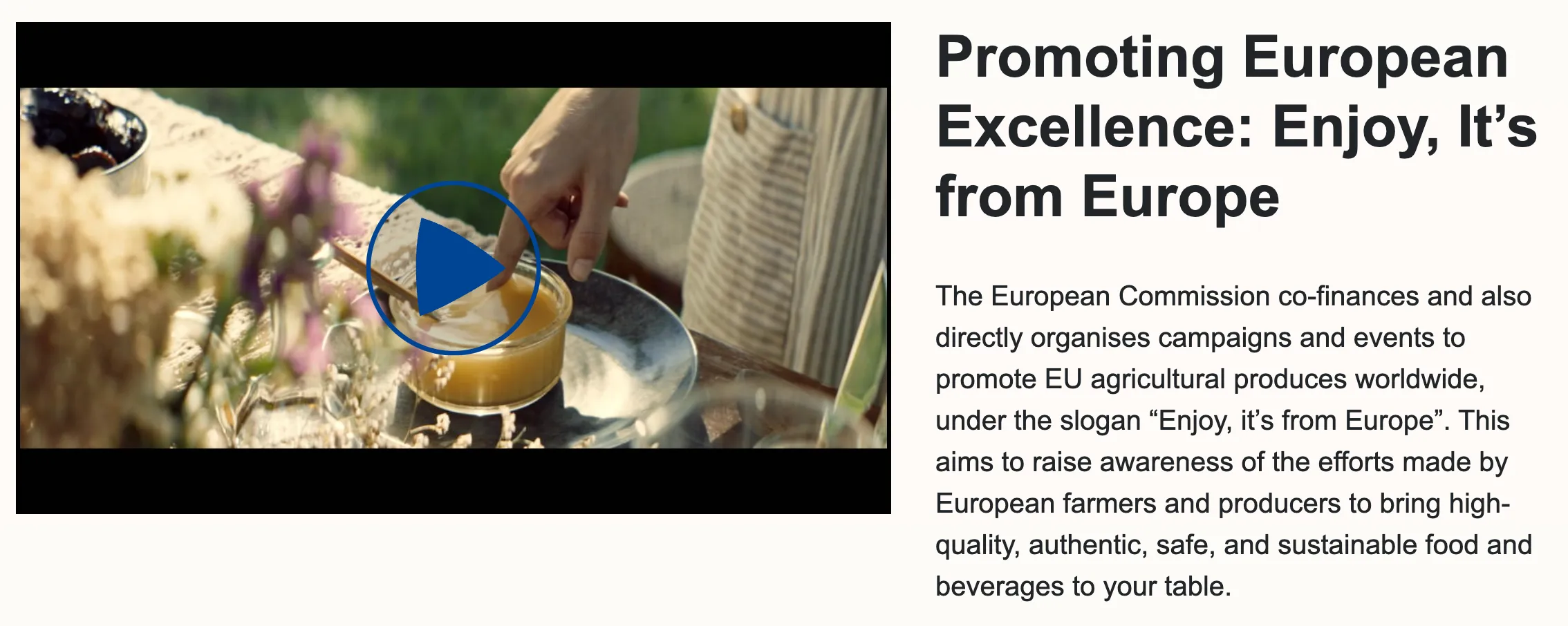
Rich text aligned video
View edit form
The title will be an H2 as the content item is part of the body of the page and will be aligned with the video for a balanced layout. The text is a short description that can be placed next to the video. It should be kept concise to avoid lengthy text, as this could result in poor layout, disrupting the visual harmony between the title, image, and description.
The placement option allows you to display the image either to the right or the left of the text. This flexibility ensures that the layout can be adjusted to suit the design needs of the page while maintaining a visually appealing balance between the text and the image.
View display mode right align
View display mode left align
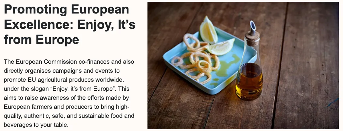
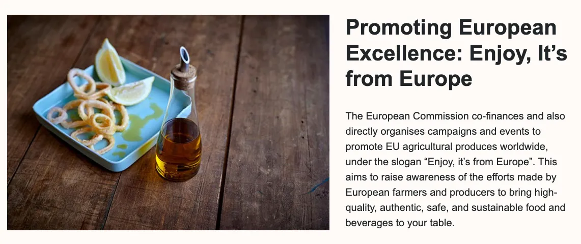
Rich text aligned image
View edit form
The title will be an H2 as the content item is part of the body of the page and will be aligned with the image for a balanced layout. The text is a short description that can be placed next to the image. It should be kept concise to avoid lengthy text, as this could result in poor layout, disrupting the visual harmony between the title, image, and description.
The placement option allows you to display the image either to the right or the left of the text. This flexibility ensures that the layout can be adjusted to suit the design needs of the page while maintaining a visually appealing balance between the text and the image.
View display mode right align
View display mode left align
Rich text with iframe embed
View edit form
The EIFE portal offers editors the ability to embed content from third-party services using iframes. This feature was specifically designed to support the integration of social media walls from services like Walls.io or Flockler.com, providing a seamless way to display dynamic, user-generated content directly within the portal.
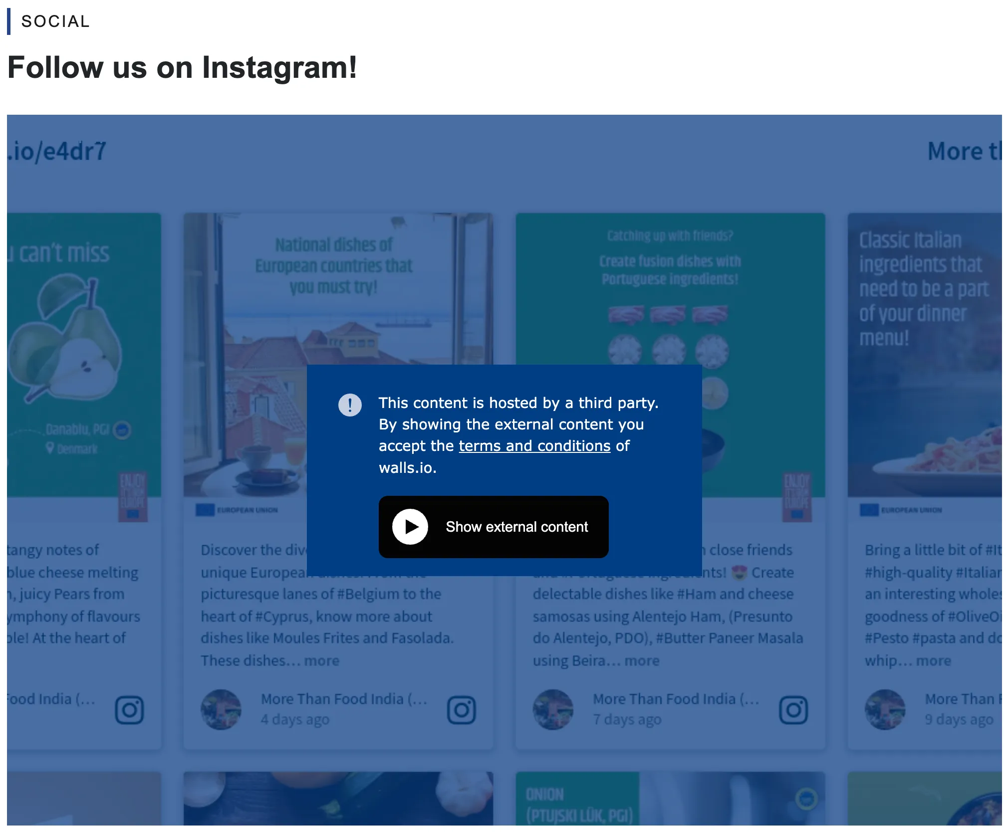
Note - on iframes
Third-party hosted iframes are subject to restrictions for GDPR compliance. Users must accept the conditions the first time they wish to view the content. Once accepted, the restrictions are lifted for all other third-party hosted content on the EIFE portal.
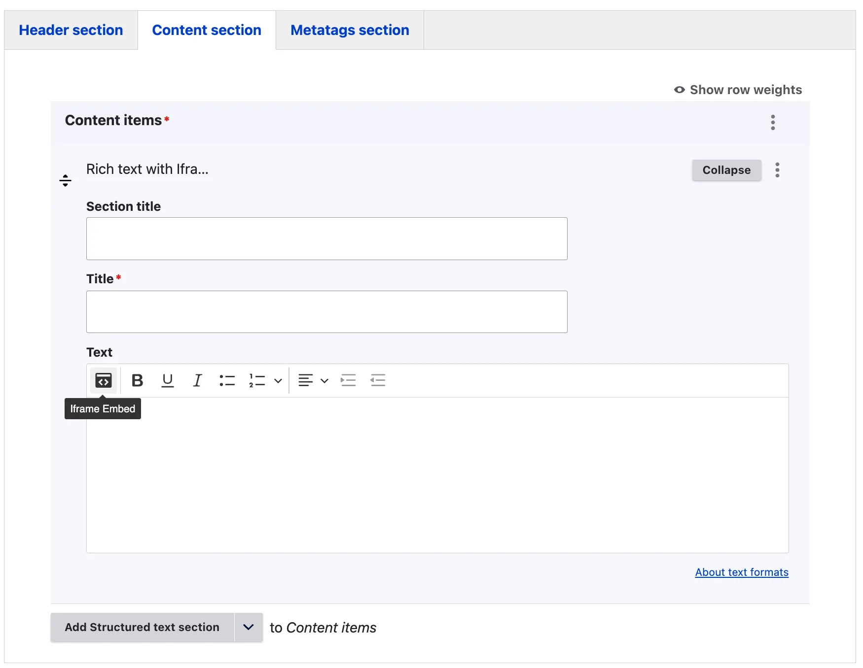
Use the iframe button to insert the necessary information provided by your third-party service.
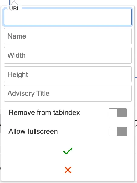
- URL: Enter the link provided for embedding by the third-party service.
- Name: Provide a clear and descriptive name for the iframe.
- Width and Height: Specify the dimensions of the iframe window.
- Allow Full Screen: Enabling this option allows visitors to open the iframe in full screen mode.
- Save: Click the green check mark to save the content.
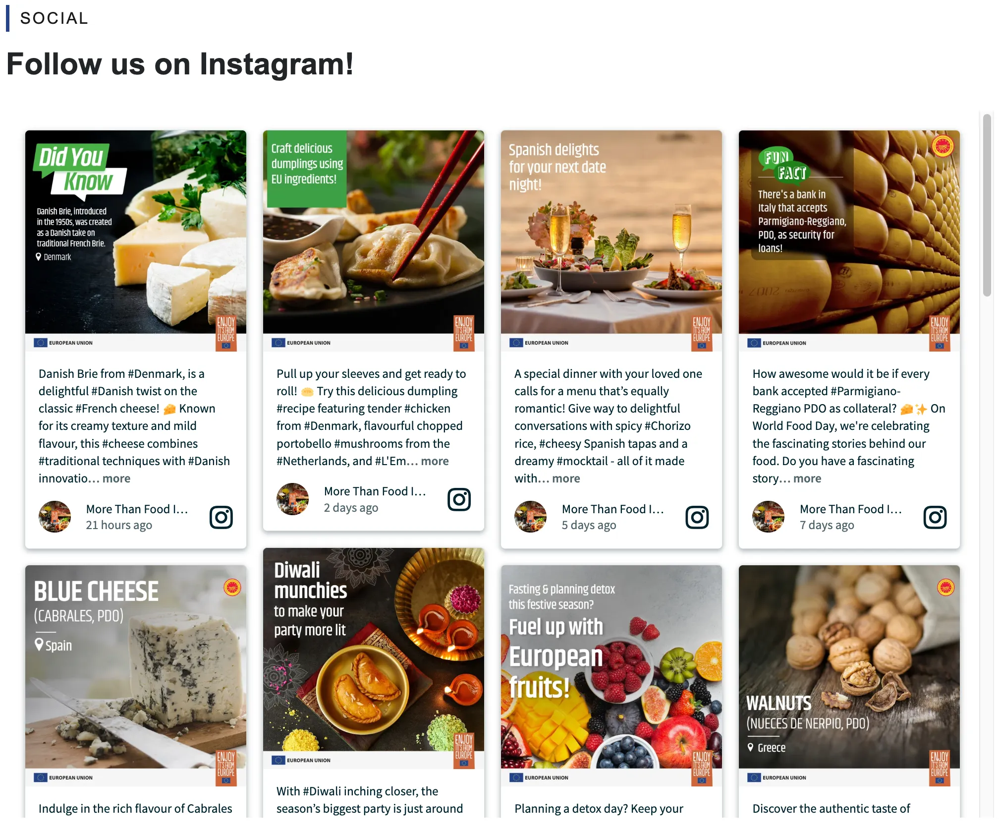
The iframe content will then be displayed within the WYSIWYG editor.
View display mode
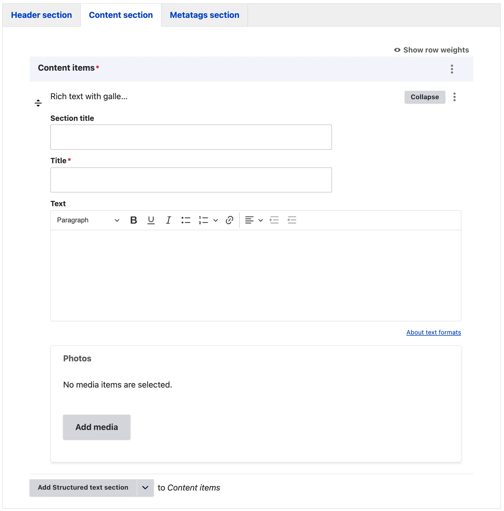
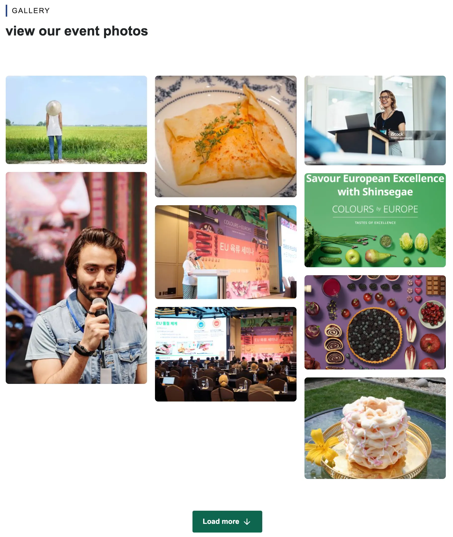
Rich text with gallery
View edit form
The EIFE portal allows editors to easily upload and display entire photo galleries, making it ideal for capturing and sharing moments from events. Editors can organise and present a collection of images to visually highlight the atmosphere and key moments, enhancing audience engagement and storytelling.
The section title enables editors to specify the type of content included in this section. For example, in this case, it could be ‘Gallery’. The title will be formatted as an H2, as the content is part of the body of the page. This is the only mandatory field. The text field should be kept short and descriptive, providing context for the image gallery displayed below it.
View display mode
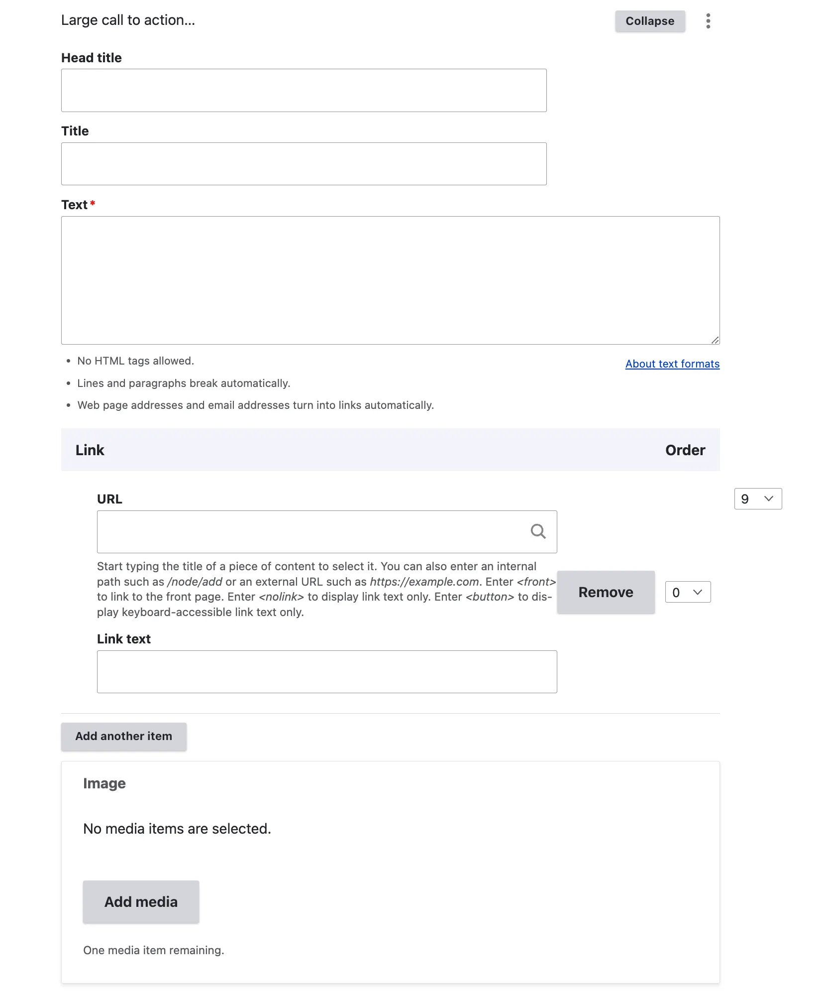
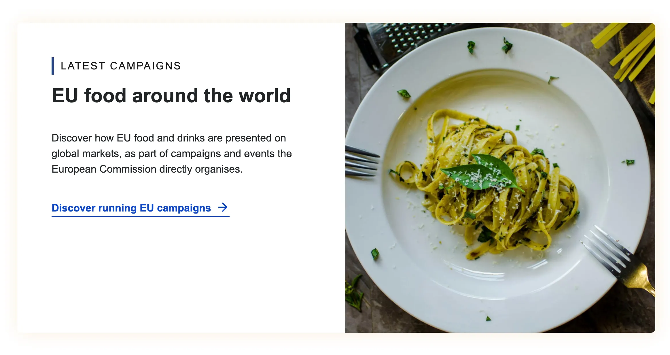
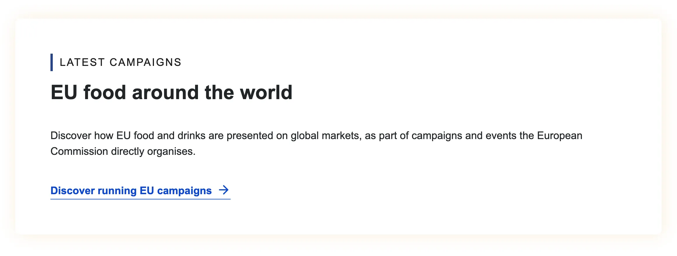
Large call to action section
View edit form
The ‘Call to Action’ content item is designed to capture the attention of website visitors effectively. As the name suggests, it is a prominent block of content that features a large, engaging image on the right side. This layout is ideal for highlighting key events, directing users to important sections of the website, or any other strategic purposes that the editor aims to emphasise. The ‘Call to Action’ is crucial for guiding visitors towards desired actions, making it a vital element in enhancing user engagement and achieving website objectives.
The section title of the Call to Action (CTA) clearly indicates its intended purpose. As this content item is integrated into the body of the page, the title is formatted as an H2 to maintain hierarchy and clarity. The accompanying descriptive text should be concise and direct to prevent any layout disruptions caused by the image positioned on the right-hand side. The embedded link within the CTA is always presented as a text link, ensuring it is easily accessible and straightforward for users to follow.
View display mode with image
View display mode without image
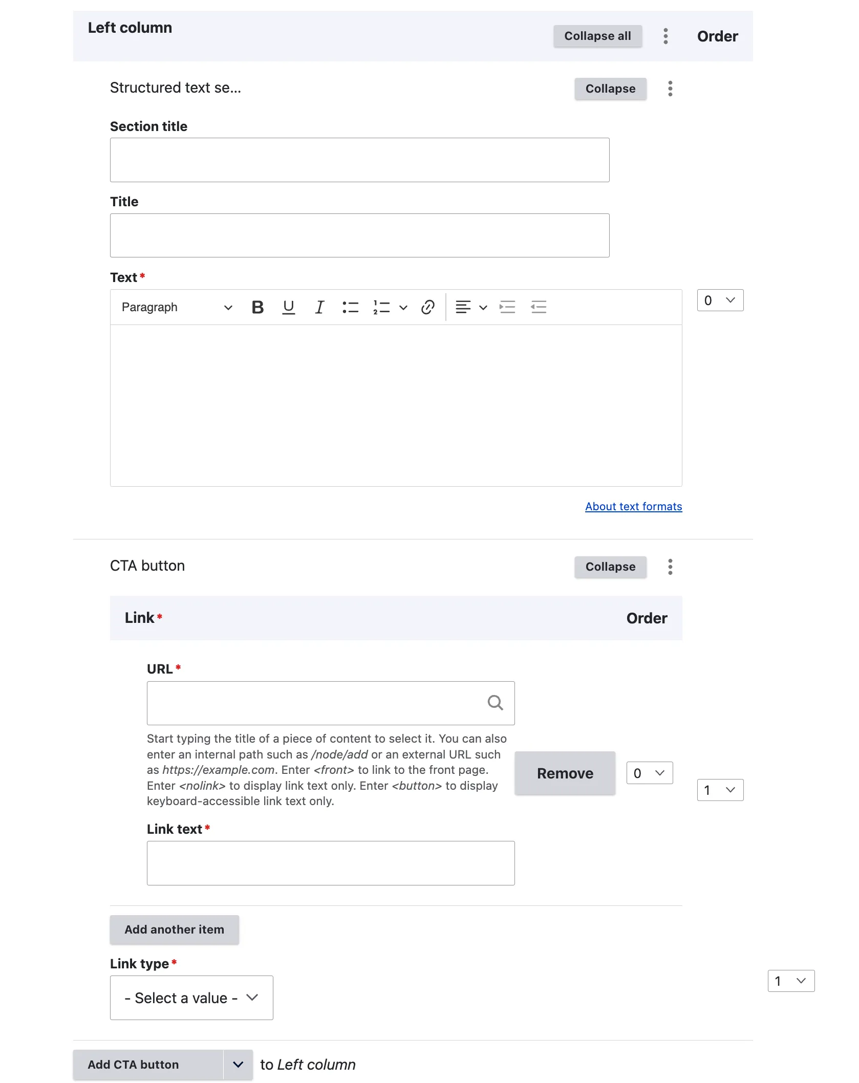
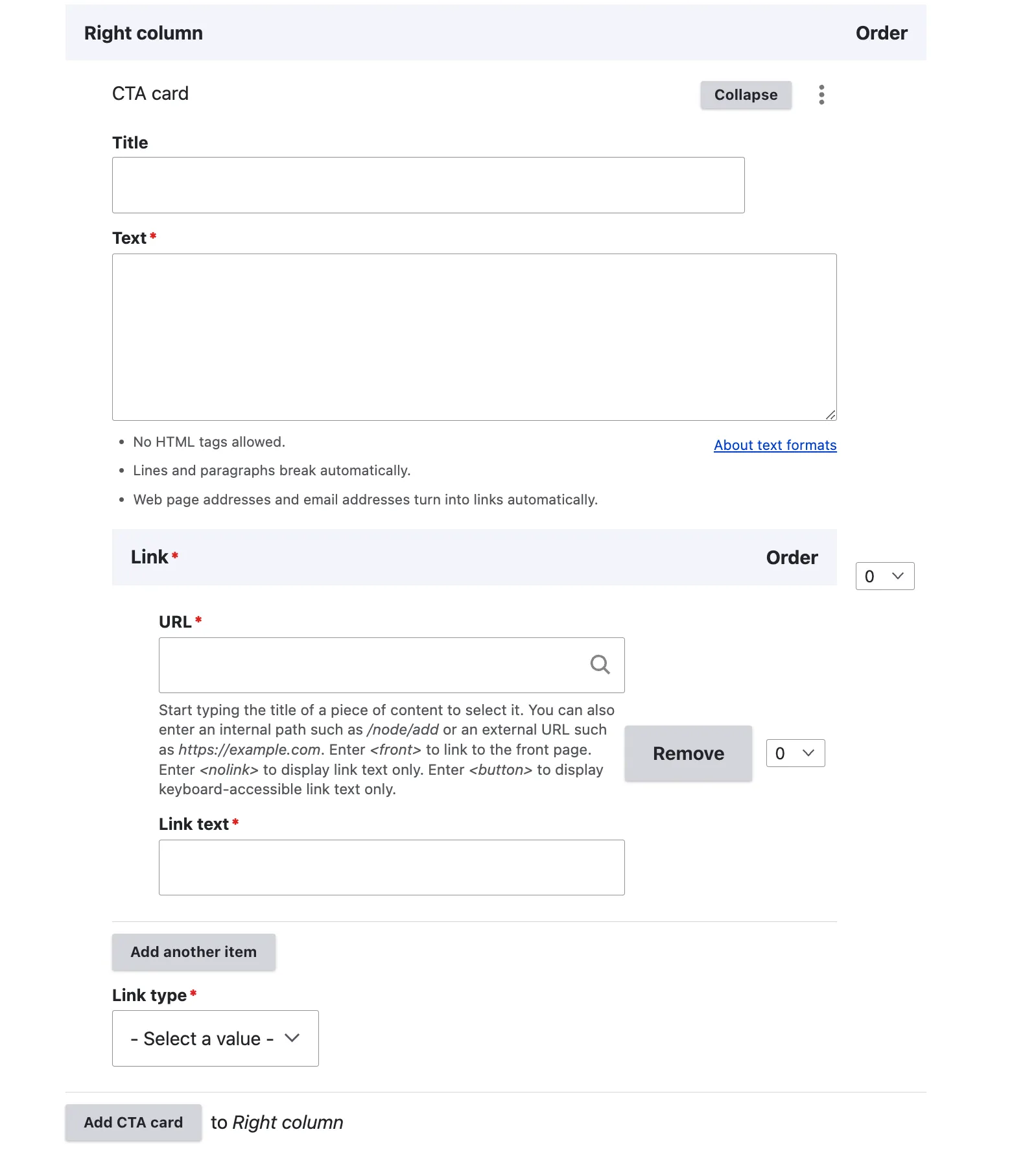
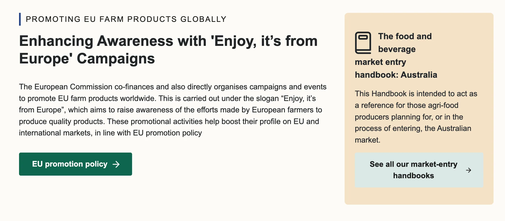
Rich text with CTA card
View edit form
The following content item facilitates the addition of content in two columns: a rich text section on the left with a CTA button, and a CTA card on the right-hand side featuring title text and a button. Only one of each item is permitted; however, if necessary, the structure can be duplicated by adding another ‘Rich Text with CTA Card’.
The left column includes a section title that clearly indicates the purpose of the content item. As this is integrated into the body of the page, the title is formatted as an H2 to maintain hierarchy and clarity. A button link can also be included to add links to internal or external content.
The right column features a CTA card designed to effectively capture the attention of website visitors. As suggested by the name, it is a content block with a highlighted card background. This layout is ideal for spotlighting key events, directing users to important sections of the website, or any other strategic purposes the editor wishes to emphasise.
View display mode
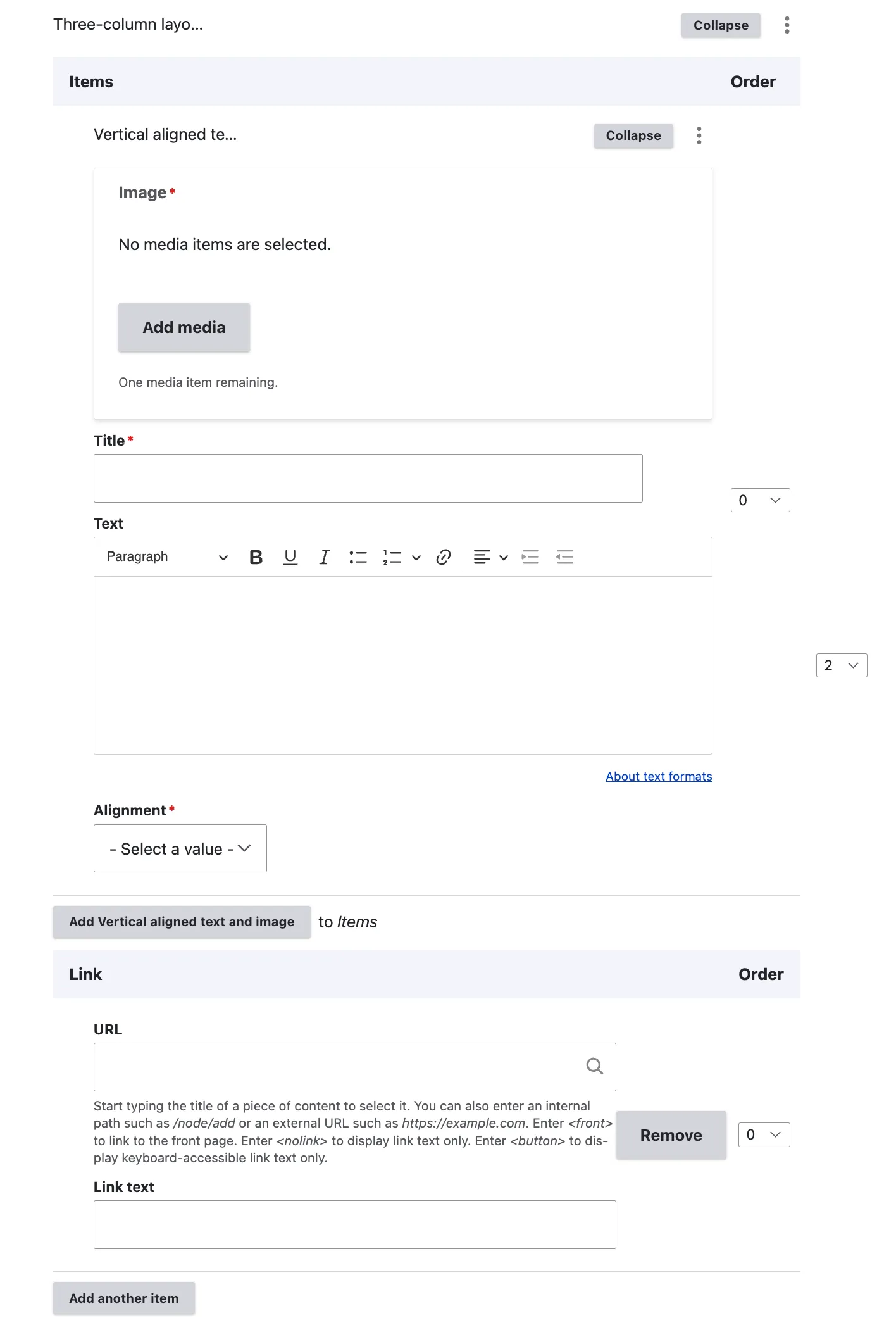
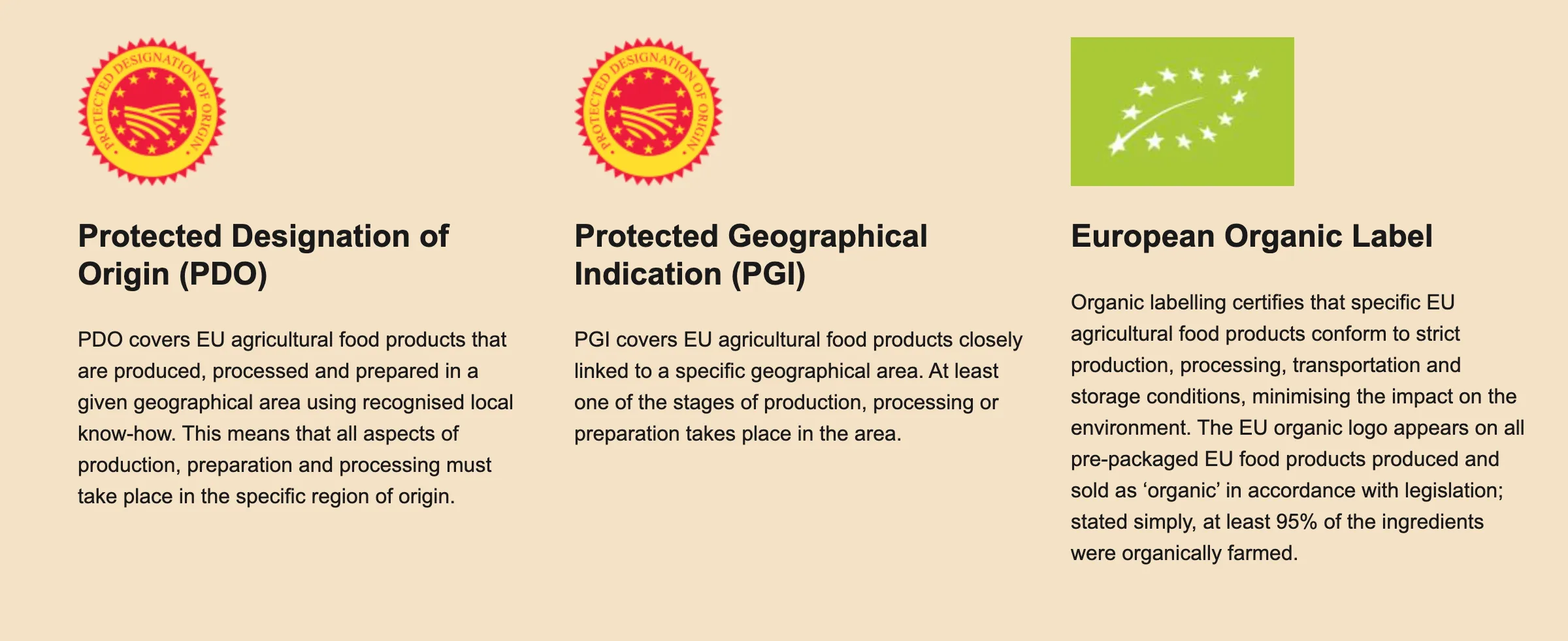
Three-column layout
View edit form
The Three-Column Layout is designed to feature three distinct pieces of content, each with an image and title, within the same row on the page. After inserting the image, title, and text, editors can choose the positioning of the image in relation to the title and text—either above or below the text.
As indicated by the content item name, editors are restricted to adding only three entries per section. Additionally, a text link can be incorporated to connect to either internal or external content.
View display mode
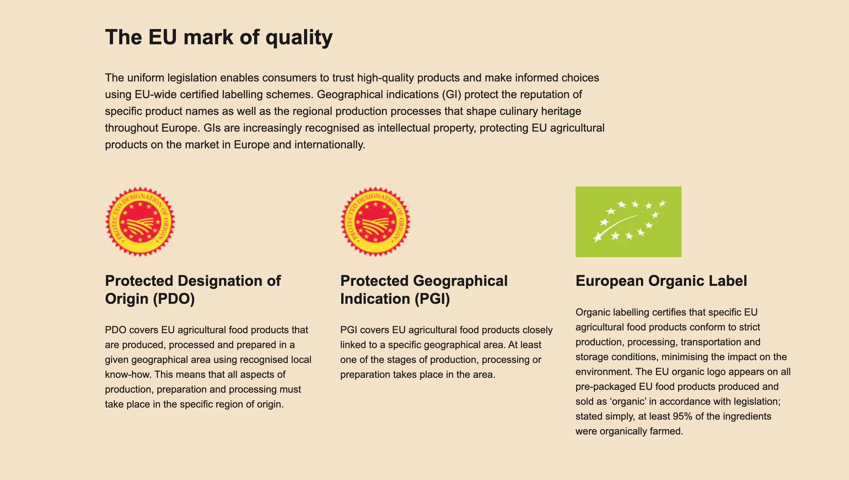
Combining three distinct content items enables the creation of structured sections within the page as demonstrated below. The three content items chosen to illustrate this example are the ‘Section’, ‘Structured Text Section’, and ‘Three-Column Layout’.
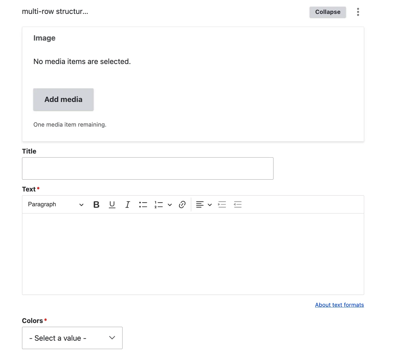
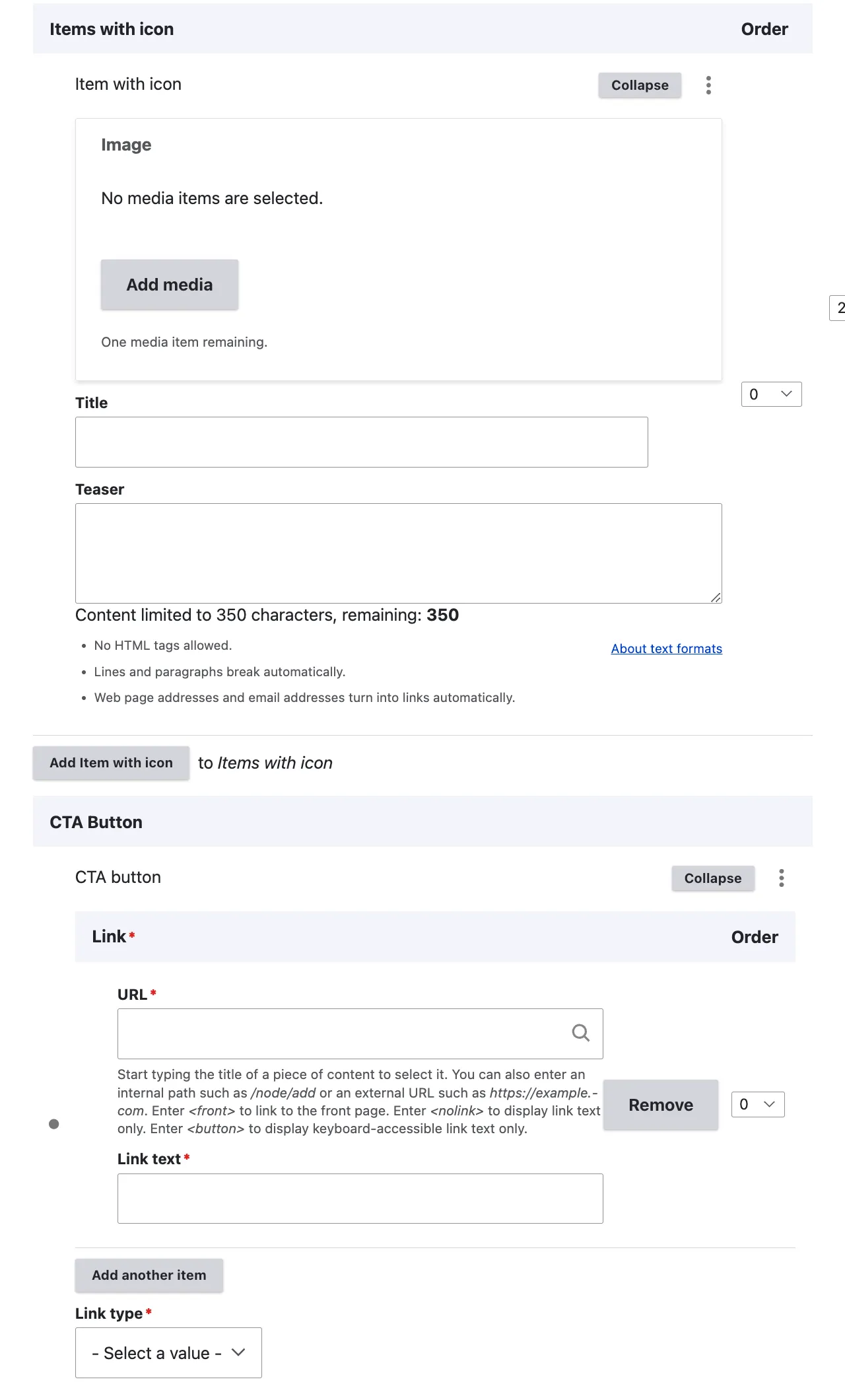
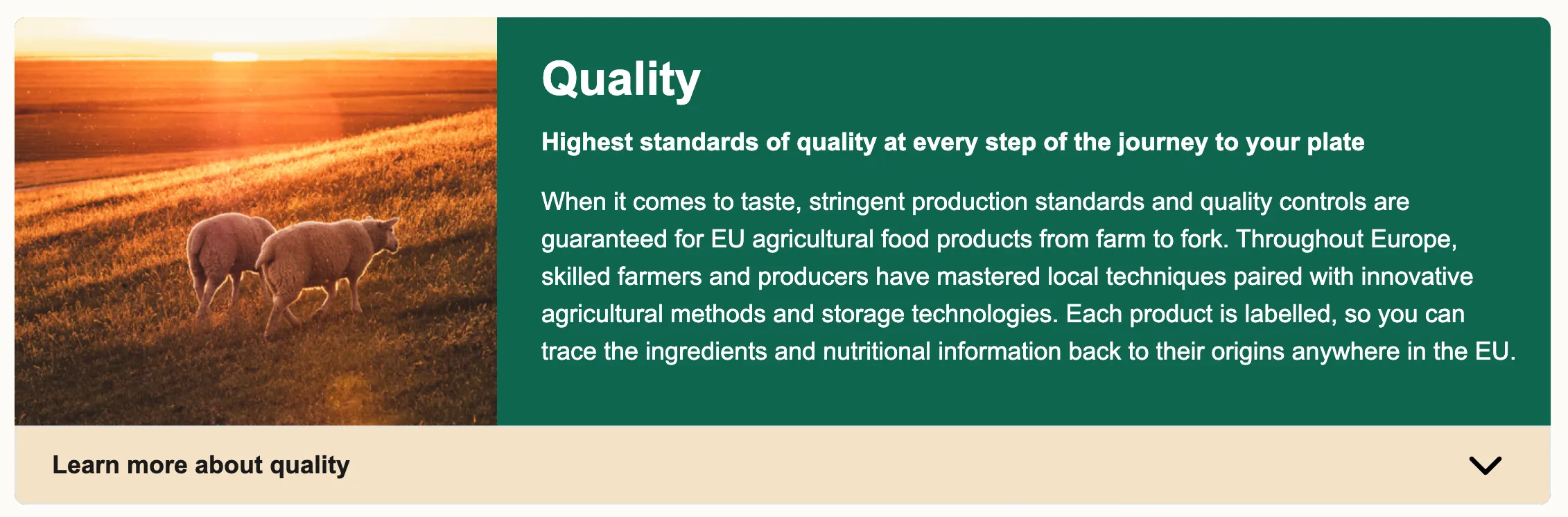
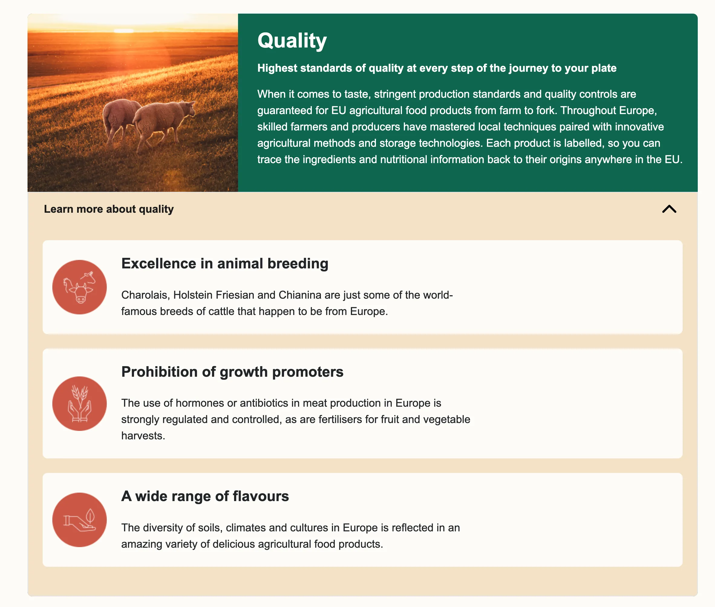
Multi-row structured content with icons
View edit form
The Multi-Row Structured Content with Icons is the EIFE portal’s most adaptable content item available to editors. It allows for the creation of visually engaging content that conveys complex messages succinctly. This content item enhances comprehension through the use of icons and additional text housed within a toggle element. The initial section features horizontally aligned image and text, with editors having the option to choose between two colour schemes: Green and Yellow, or Yellow and White. The icon section, which is hidden by default in a toggle-off element, includes an image, a title, and a teaser limited to 350 characters. Editors can add multiple items to this section. Additionally, editors have the flexibility to attach a text link to each content item, directing users to either internal or external pages, as necessary.
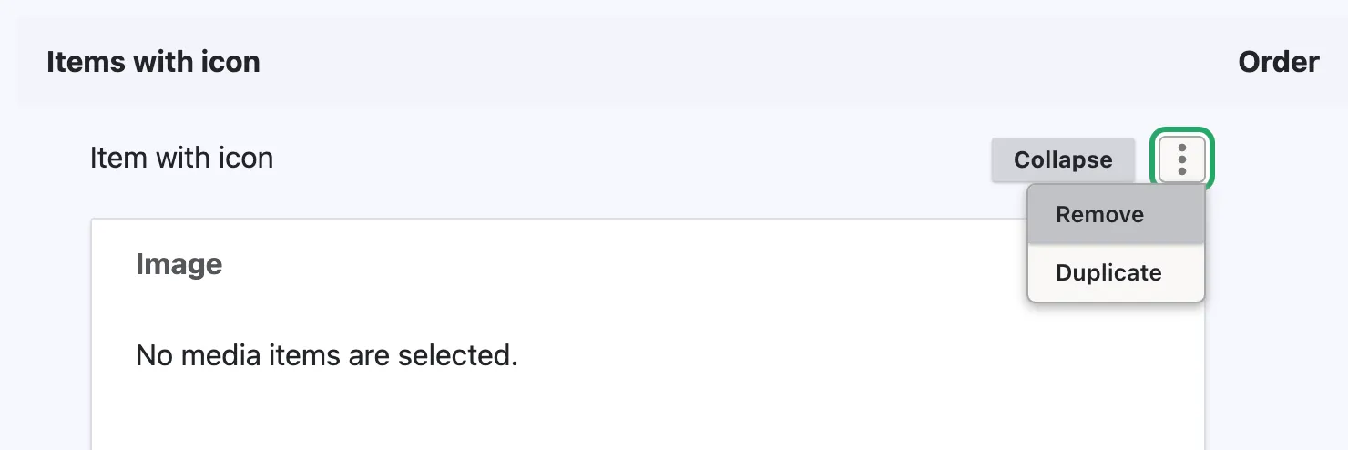
Note on toggle off element In case the learn more section is not required the editor must actively remove the entire items with icon section to ensure no residual visual element is displayed on the page. This can be achieved by clicking the 3 buttons menu and selecting remove
View display mode
Learn more toggle open
CTA button
View edit form
The CTA (Call to Action) Button is a standalone content item designed to allow editors to enhance existing content by adding a button. This feature provides a convenient means to link to either internal or external content, extending the engagement potential of the page.
In some instances, the CTA Button is integrated into other content items; however, its core functionality, as described here, remains consistent.
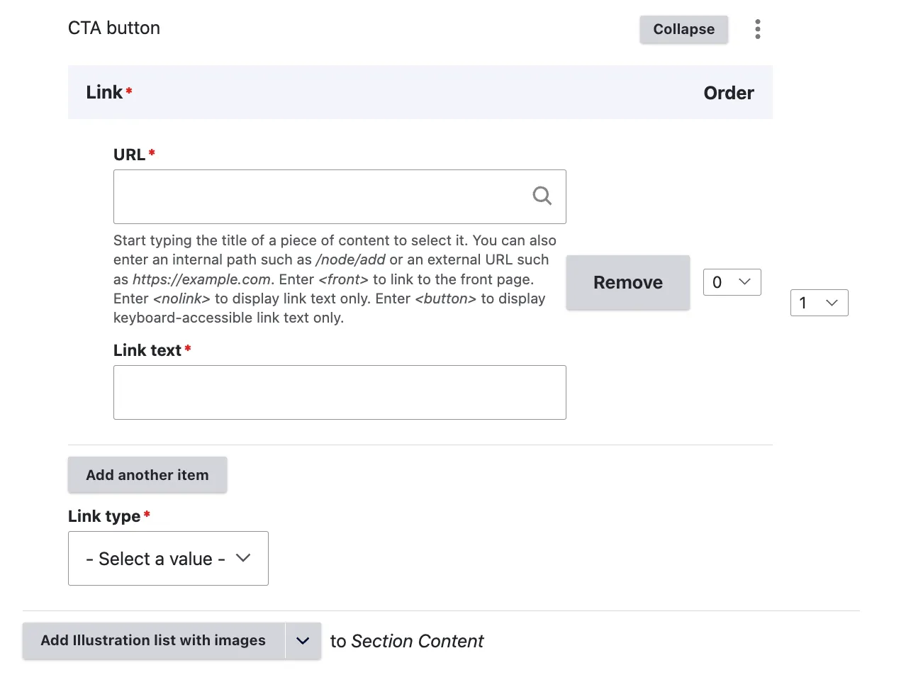
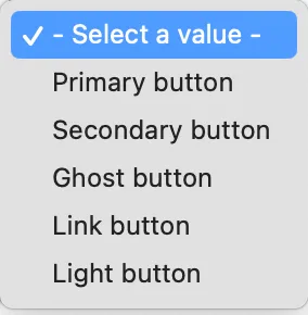
There are five different types of button styles that can be selected.
View display mode
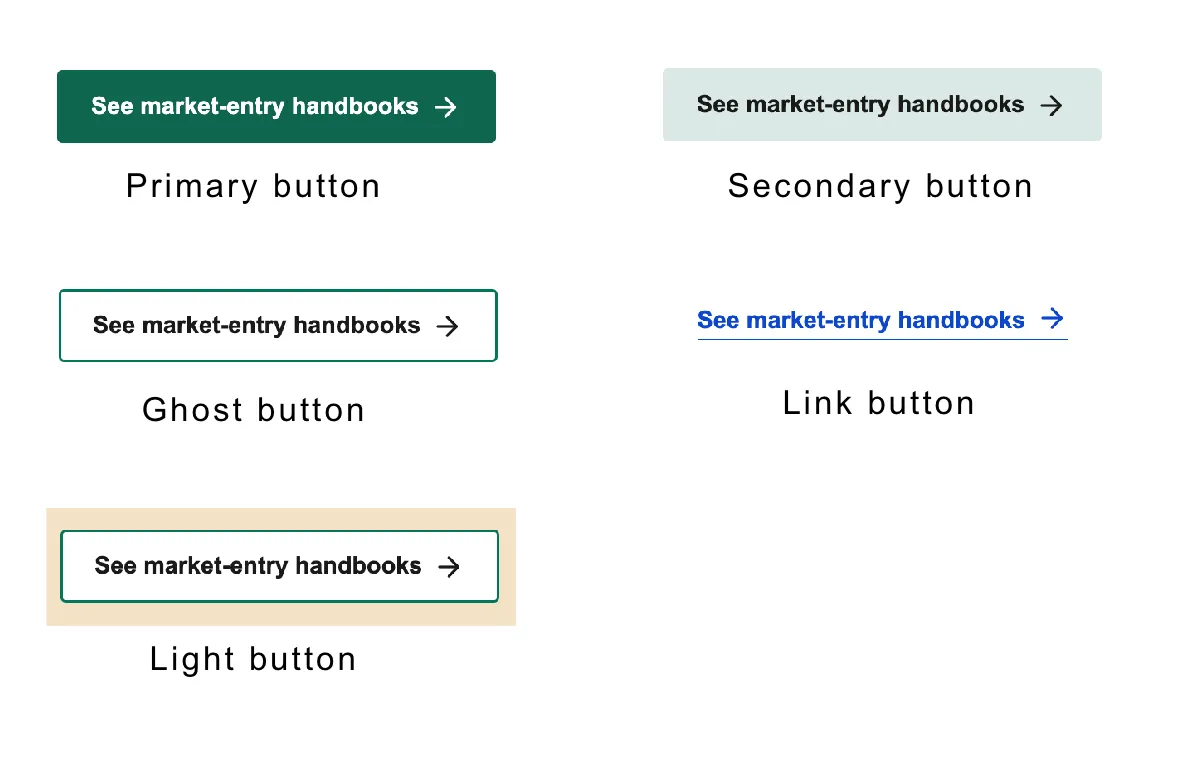
Note on buttons The Ghost button has a transparent background, and its colour matches the background on which it is placed, outlined with a primary colour border. The Light button always has a white background, irrespective of the surrounding colours.