UI introduction
ui-introduction #EIFE version 0.1 | 1m 52s Read time
The new EIFE portal and country sites have been designed to create a bespoke, recognisable, unified visual identity. Its contemporary, premium look and feel is future-proof and optimised for digital use.
There are five main elements that shape the visual look and feel of the website design:
- Colour palette
- Typography
- Imagery
- Iconography
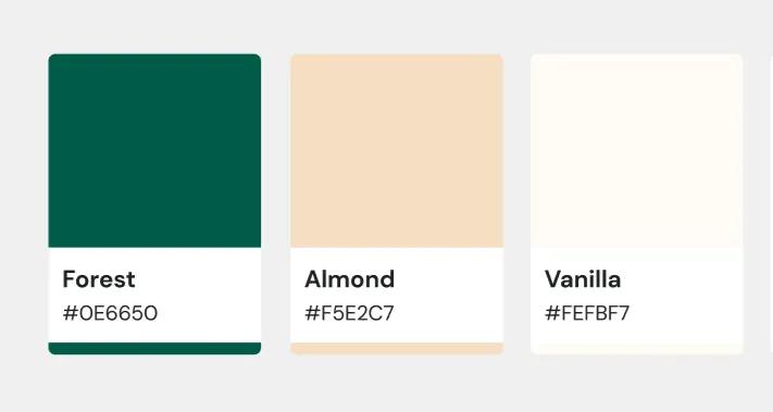
Colour scheme creates associations with natural, organic and fresh produce, uncompromising quality and sustainability. At the same time, it stays close to the existing CHAFEA visual guidelines, seamlessly integrates the EIFE signature and echoes the EU branding. The colour palette was designed to ensure it is complementary and compatible with certain mandatory ECL components – the harmonised site header, footer and horizontal menu. It also fully complies with the accessibility and usability standards, bringing sufficient colour contrast.
The primary colours of the UI style
Primary colours
Secondary colours
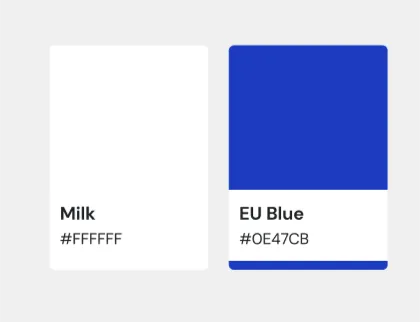
Leveraging the contrast between deep green and soft neutrals, the focus in the overall interface is always on beautiful imagery that celebrates and elevates the EU agri-food products.
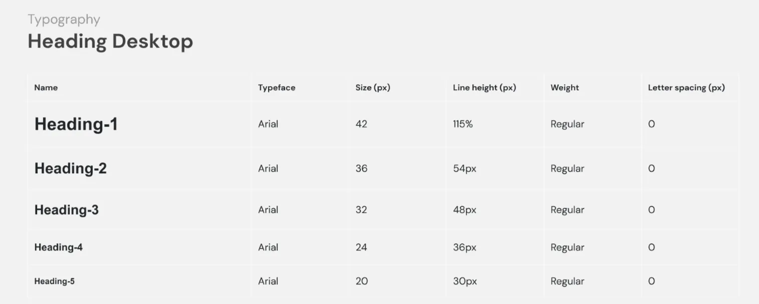
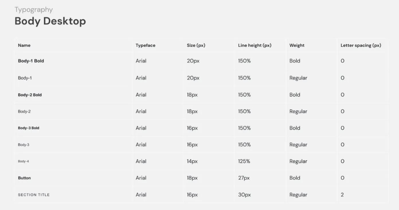
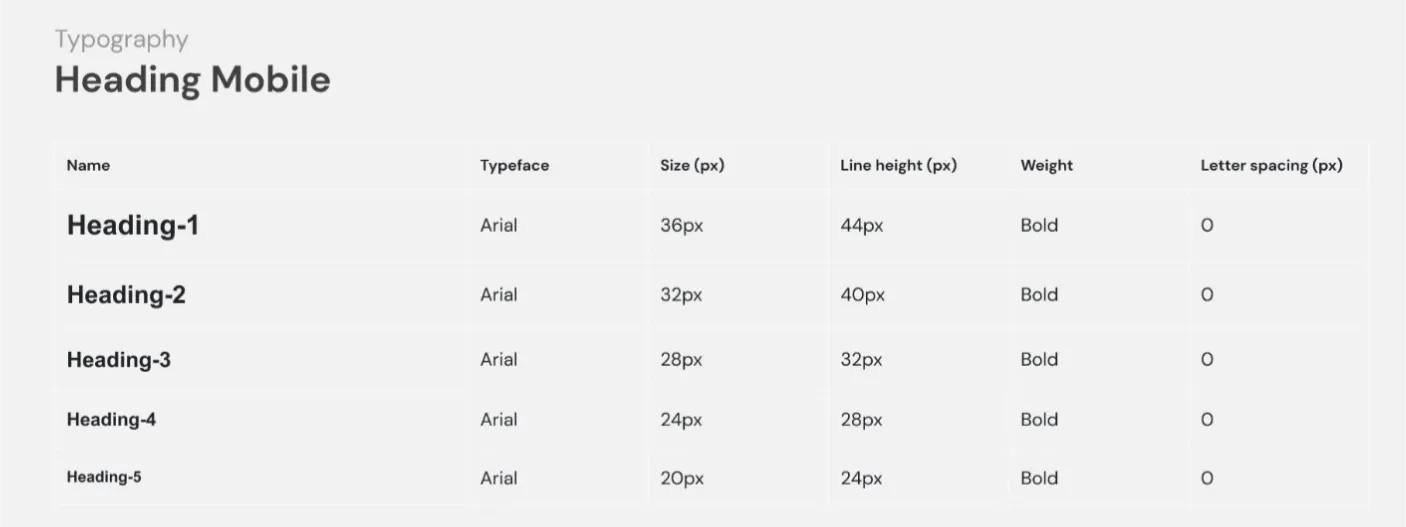
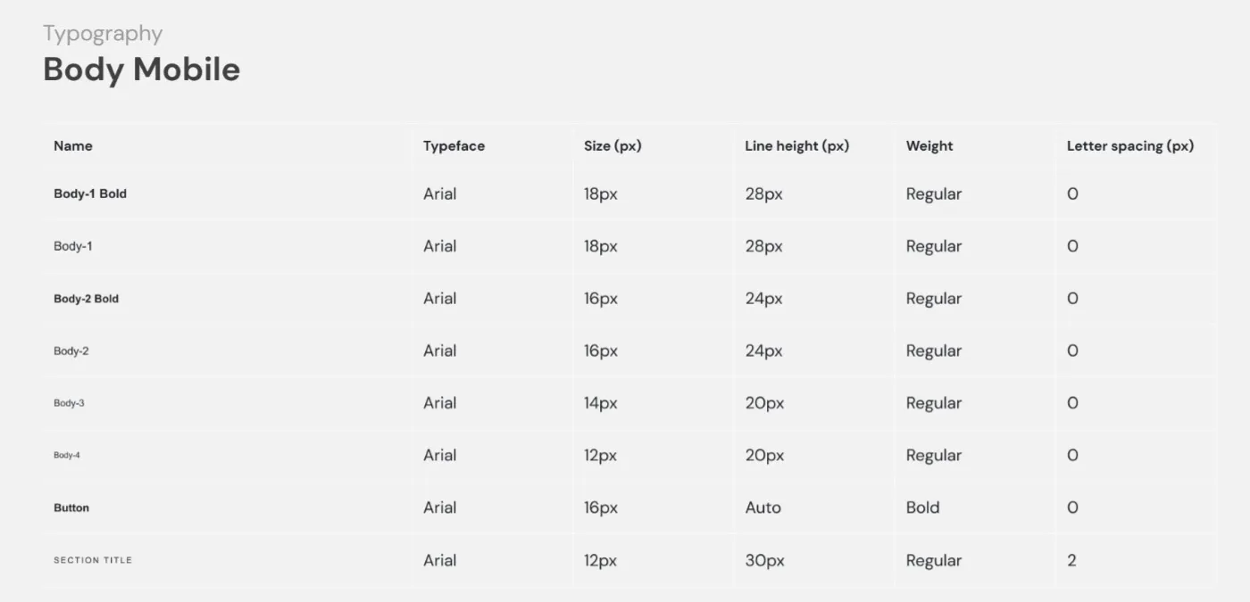
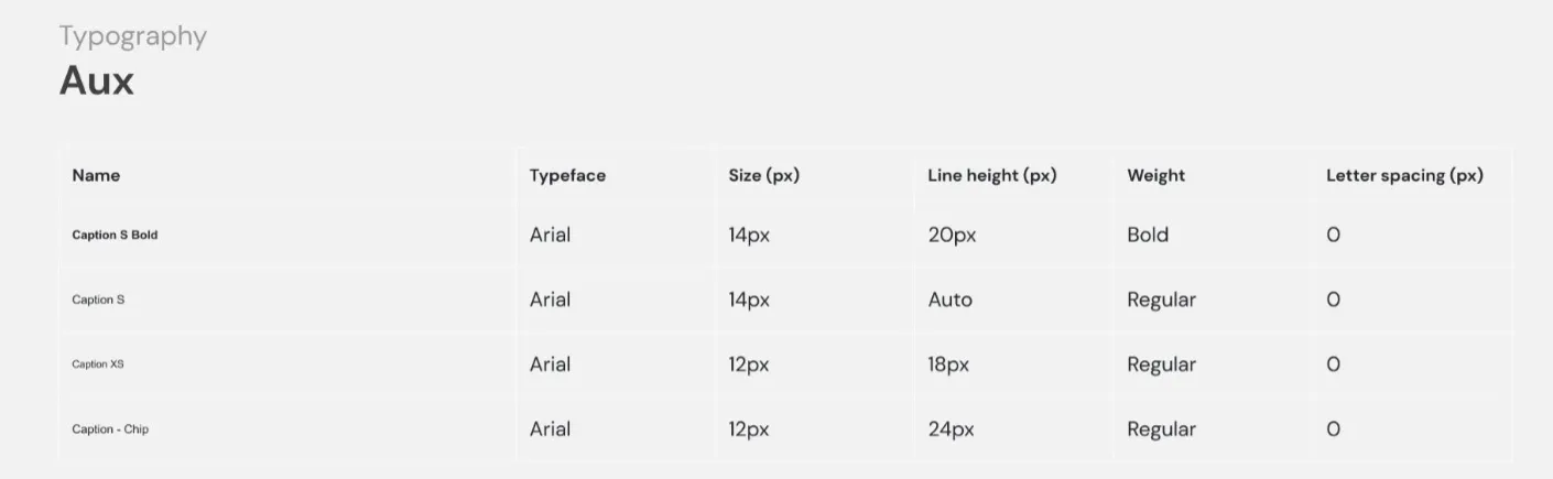
Typography
Typography is based on Arial font family to align with the standard EU branded typeface. Arial is highly versatile and universal, ensuring compatibility with other alphabets and languages. Various weights are used to differentiate content hierarchy. Bold style is typically used for headings, CTAs and titles emphasising the importance of content. Regular text is used for body text and other interface elements. We use different type sizes for different screen sizes to create a balanced, proportionate and visually pleasing design and to ensure readability.
Imagery
Using an image-driven approach to page layouts and component design allows you to showcase diversity and uniqueness of European products and inject the visual identity of your local campaign. Since the portal and country sites for EU-owned initiatives are part of the same platform and reflect this also visually by keeping the same visual identity, your chance to showcase the individuality of your local campaign can be achieved by using distinctive photography and videos. In most page templates, there is a built-in flexibility to use photos and videos in various formats.
Iconography
Sometimes use of icons can facilitate content comprehension. It is also a useful and effective way to represent common actions. You can use icons to enrich the campaign website by choosing from an existing CHAFEA icon library. Alternatively, you can create new icons in the same style (use only primary colours and 1,5px line thickness) and upload to the site. Avoid creating icons too detailed and childish. Keep them as simple as possible to retain the premium look and feel and to make them effective on small screens.
Country-specific campaign branding can be applied through the use of creative media assets – videos and images and content and tone of voice.